Category

Website Guidelines

Mobile-Friendly vs. Responsive Websites: Which one wins?

By Website Guidelines

It has been over 5 years since mobile web usage surpassed desktop web usage worldwide in 2016. In those 5 years, a lot has changed in how websites are designed, built, and interacted with (for the better, we think!).

Even with the passing of time, there are many website design & marketing agencies that have not adapted to fit the current standards for providing a positive user experience on phones, tablets, desktops, and everything in between by switching to a Responsive Design vs. Mobile-Friendly.

What do we mean? First, we must define these two terms.

What is mobile-friendly website design?

We can think of mobile-friendly as the way that websites were designed when internet on phones first became a thing at all. Website designers & developers alike suddenly had to contend with the fact that people were looking at their websites on a screen that is one-fifth the size (or less) of the screen size the website was built for.

How did they adapt? With mobile-friendly design. This can be done in 2 different ways:

Designing one version of the website that functions the exact same way regardless of the device, it just scales up or down in size to fit the screen.

Designing one desktop version of the website, and one mobile version of the website, that can scale slightly in size to fit the screen.

With this second option, designers are designing 2 different versions of the website, and developers are building 2 different sets of website files to reference. This is also sometimes referred to as “mobile-optimized”.

You might remember a time where visiting a website on your phone led to a URL that looked something like “m.website.com”. The “m” prefix to the domain is what ensured your phone would see the version of the website that was designed for smaller screen sizes.

This was a great solution at the time for ensuring users could easily interact with a website from their Macbook to their iPhone.

But now, we’ve entered a world where users could be visiting your website on virtually anything. From an LG TV screen they hooked up to a computer, to their brand new curved Samsung Monitor, to their average HP Laptop, down to their old, tiny iPhone 5 or the newest Mega Plus XXL Smartphone (okay, we know that one isn’t really a thing… but it sounds like it could be, right?!)

So – what’s a website design team to do? This is where responsive design comes in.

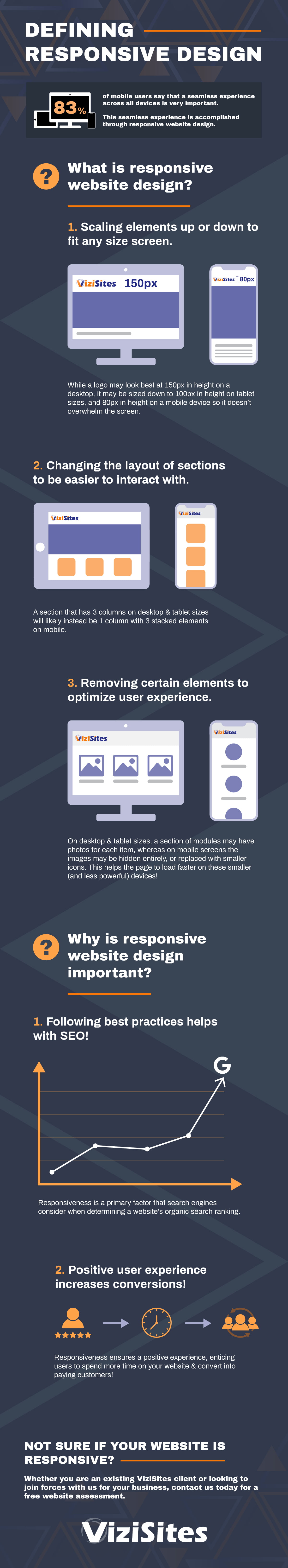
What is responsive website design?

Responsive website design is what happened next. Now, with advancements in technology, coding, and more – we’re able to design dynamic websites that respond according to the screen size being viewed on.

A truly responsive website design will have elements of Mobile-Friendly design, in addition to more modern elements of responsiveness. At ViziSites, these are just some of the ways we may build a responsive website to behave to provide the best user experience on any device:

1

Scaling elements up or down to fit any size screen

Example: while a logo may look best at 150px in height on a desktop, it may be sized down to 100px in height on tablet sizes, and 80px in height on a mobile device so it doesn’t overwhelm the screen.
2

Changing the layout of sections to be easier to interact with

Example: a section that has 3 columns on desktop & tablet sizes will likely instead be 1 column with 3 stacked elements on mobile.
3

Removing certain elements to optimize user experience

Example: on desktop & tablet sizes, a section of modules may have photos for each item, whereas on mobile screens the images may be hidden entirely, or replaced with smaller icons. This helps the page to load faster on these smaller (and less powerful) devices!

These techniques may be used all together in varying combinations for different screen sizes in order to accomplish the creation of a website that is dynamic in nature, and pleasant to interact with no matter the size of the device.

Responsive Design: More Than Just Looks

Not only does responsive website design ensure a positive user experience no matter where a potential client may find you, but they also make the search engine powers-that-be happy. Responsive website design has now become a standard part of website functionality that search engines like Google take into account for SEO.

Ways Responsive-Design Helps Your Online Presence

We’ve opted to use responsive design at ViziSites because it has been shown to be the best option for website functionality. Here are some of the ways that a responsive website benefits your business:

  • Following Google’s standards for website design helps with SEO (search engine ranking).
  • Responsive website designs load quickly, helping to reduce bounce rates.
  • Responsive websites provide a positive user experience no matter where a user might find your website, increasing the likelihood of them choosing you as their provider.

At ViziSites, we’ve developed a strong reputation for high-quality websites that don’t just look great, but they perform great, too. Our team of website designers and developers use data-backed insights to create websites that are more than just a glorified business card in the sky. We believe your website should be a valued, productive member of your team, and that all starts with a responsive design that allows you to reach all of your potential audiences.

Not sure if your website is responsive? Whether you are an existing ViziSites client or looking to join forces with us for your business, contact us today for a free website assessment.

Written by Josh Cumpian, Director of Technology
Connect with Josh on LinkedIn

How to Protect Your Business Using Simple Data Security Techniques

By Business, Website Guidelines

At ViziSites, we place a high value on educating & consulting our clients. Even a small amount of education or training is a protection when it comes to a field you don’t specialize in. Similar to how you want pet parents to know the most common household toxins for their pets, we want you to know some of the common dangers facing your practice.

In this case, knowing how to make your practice more secure can literally save you hundreds of thousands of dollars in insurance claims.

Did you know the average AVMA PLIT claim is $133,000.00? Take a few moments to look over this Blueprint for Better Security we created in partnership with Lucca Veterinary Data Security, and protect yourself from ever having to make a claim like that!

Learn how to implement each of these steps easily in your practice with a FREE copy of “5 Simple Steps to Protect Your Practice”.

More than the SSL: Is your website secure?

By Website Guidelines

Is Your Website Provider Securing Your Business Information?

There are many factors to consider in determining whether a website is truly secure. In this article, we focus on Username and Password strength. What is the security standard employed by your website provider? It’s a good idea to ask. Why? Two quick reasons to consider.

1. Repeated Password Vulnerability

Website providers might be tempted to cut corners when it comes to securing your website’s credentials. Usernames and passwords could be repeated across multiple clients for the ease of their own support team and to cut down on the length of build time. This means if one client’s account is compromised (hacked), yours could be, too. Once compromised, this could lead to your website serving questionable content and being flagged by Google, ultimately affecting organic search ranking and the business that comes to you through your site.

2. Password Storage & Complexity

What is your website providers standard when it comes to password strength? Who does your website provider use as an authority when it comes to creating strong Usernames and Passwords?

Some website providers might let such decisions rest with their current developers own reasoning on the topic rather than using official Technology standards and guidelines provided by NIST. NIST is the National Institute of Standards and Technology by the U.S Department of Commerce. Standards are provided by NIST for companies to use as guidelines when it comes to the length and complexity of Usernames and Passwords.

Want to know more about such standards that you can use as a reference when asking your provider? Here is a good place to start.

—–

Have more questions about website security standards at ViziSites? Call us at 760-658-9303 opt. 1 or contact a consultant today for a free demo!

Written by Josh Cumpian, Senior Developer
Connect with Josh on LinkedIn

Turning Language into Design: Behind the Developer’s Curtain

By Website Guidelines

Ever wonder how those image modules change color, or how that dropdown menu on a website animates? We all know that design plays a strong role in how our sites appear to the public, but what about the functionality? What makes the site really tick? This is where developers come in: they give your custom website that extra “wow” factor. Today, we have a special little segment we would like to share on the magic of development and how they make modules on a website function. If you’re interested in learning, let’s take a look at a few things that makes these elements possible…

We’re going to use a set of modules from a client’s site our developers have recently worked on. First, let’s start with the code types used to make all of this element’s features come to life.

The Code

As we all know, this process can become quite complicated. More function and style in the element means more lines of code are involved. Here, we will discuss the three coding languages required for the element above: HTML, CSS, and Javascript.

HTML

HTML is the skeleton of the page or element. This tells the browser to display the hard elements. (Images, Copy/Text, and objects like menus etc.) As you can see in the image below, there is nothing visual except the links and text of the elements.

CSS

This code is like the muscles and flesh of the element. All layouts require CSS to stylize and format the objects in relation to what is around them. This is the same language behind CSS Paintings – an awesome form of digital painting (well, at least we think it’s awesome)!

In the example below we see that the modules are now styled with color, shape, and size. There is animation attached to this through CSS, but we don’t quite have a complete product yet. These modules still require function. That is what leads us to adding Javascript.

Javascript

This code is the brain language of the page or element. Javascript tells the elements how to function. This could be movement/animation, or a hover effect such as disappearing/appearing.


[Video above has no sound. Captions not needed.]

An Understanding of Layout

It’s important for developers and designers alike to understand spacing and placement. This is required for all elements to work together and create a finished product. This is why we apply a solid system of responsive features on all of our websites. Our Development and Design departments work hand-in-hand to make sure none of the elements on a page are crashing into each other and adhere to rules of alignment on all of our sites.

In the build process, we are careful to code assets in a way that makes them responsive from the beginning. This means building elements to look good and function well from a large desktop all the way down to a small phone. Even with that in mind, there may be adjustments needed as small details on the website change. This is why it is important that each developer understands which code applies to each section of the site, and uses the correct language to make the needed change. Because if you accidentally use the wrong bit of code, or take out a piece of code that had a different purpose than you thought…


Patience and Problem-Solving

There is a lot of code used to make all elements of design look good and function. This naturally creates problems the more complicated the designs and layouts become. Most often, developers spend more time solving problems related to writing code for a brand new element than fixing code on a broken element. This is the nature of creating elements on any platform whether it be apps for a device or websites for a browser. With a lot of patience and hard work from developers, they are able to untangle the metaphorical “wires” that get all bunched together when a lot of work is put into projects.

So the next time you see an element on a website move, change colors, or appear on a website – maybe you’ll have a developer brain moment and be able to take a guess at which language of code was used to create it!

—–

Have more questions about what impressive custom features ViziSites’ developers can build on your website? Check out our portfolio of websites, or contact a consultant today for a free demo!

Written by ViziSites’ Development Team
Connect with Josh on LinkedIn

SSL Certificates & Site Security: Why You Should Care

By Website Guidelines

What is all this about SSL?

If you’ve made it to our website, and our blog, you probably already know that internet marketing is a constantly evolving industry. As the internet becomes a more integral part of sales and marketing, more and more changes come as well. One of the biggest changes came when Google practically made SSL a requirement for websites. How?

In 2016, Google announced that Chrome would begin to mark websites that were on http:// as “Not Secure” – not only that, but eventually this “Not Secure” message will be red and have a hazard icon when users hit that page. (Which sounds like a great way to scare users away from your website if it’s not secure… and you don’t want that!)

This is yet another addition to the growing list of reasons why HTTPS is becoming an integral part of website set up. Back in 2014, Google also announced that whether or not a site has HTTPS would be included in their search ranking algorithms – therefore affecting your organic search ranking.

We happen to think that those two reasons are good enough to make sure everyone is on HTTPS. Hmm, maybe that’s why Google is pushing for #HTTPSEverywhere.

So, what did we do?

As part of our already exceptional product, ViziSites includes an SSL certificate for all of our websites. If you have not yet adopted HTTPS for your domain, this could be a very positive change for you. Site visitors & search engines will see that your website is secure, therefore bringing more consistent traffic to your website (that’s potential business!).

Web users are becoming more and more educated as information is more readily available to them than ever before. Many users will not pay for a product or submit any other personal information (such as a phone number, email address, or more) on a website they know is not secure. Don’t let an insecure website get in the way of your lead generation!

Want to know more?

If you would like more information on what an SSL certificate is, or how Google’s standards are changing, check out this article on Why HTTPS Matters.

Still curious? Please feel free to call or write, our internet consultants would be happy to tell you more.

Written by Cassandra Parsons, Director of Client Experience
Email | Connect on Facebook

Best of Breed Partners


ViziSites has partnered with a collection of service providers in the veterinary industry and beyond. When you sign up on the Competitor package or higher, you’ll gain access to discounts with our partner businesses like VerticalVet Reminders, Veteos, Vetstoria Live Booking, and Anipanion Telemedicine!

Sign up to have your free e-book emailed to you today!