Branding Series Pt. 1: Components of a Good Logo

By January 14, 2019Marketing

When you see a red target on the side of a building or an apple emblazoned on the back of a smartphone, what are the first things that come to mind? Odds are you will quickly associate these icons with Target and Apple. But why does the brain make that instant connection? Is it the signature red that Target splashes across its stores? Would the Apple icon be as recognizable without the bite taken out of it or the leaf angled to the right? These are only some of the variables that designers keep in mind when creating a logo and establishing a brand.

Recently, we touched on the importance of consistency in relation to branding. Now, let’s zero in on one of, if not the, most important elements of branding: the logo.

What are the components of a good logo? Is it the vibrant colors you selected or is it choosing between serif and sans serif fonts? These elements are important to a well-designed logo, but let’s take an even closer look at five fundamentals of a successful logo that is relevant, simple, versatile, unique, and timeless.
Relevant

What does your brand/business offer? Who is your target audience? What quality of service are you trying to portray? These are some of the questions you want to answer before you start the logo design process. This ensures you know why you want a particular design or style or color so you can make the biggest impact wherever your logo is used.

Simple

Whether you offer a wide variety of services or you have many ideas you want to combine into one, it is easy to end up with a logo that is too complex. Keeping your logo simple makes it easier to recognize and easier to apply. Imagine trying to fit five different icons on a business card or a shirt without needing a magnifying glass to see it!

Versatile

Designing a logo that is adaptable allows you to place the logo wherever you want. From brochures to websites to product tags, your logo should be discernible at any size and in any color (full color, black, and white are some of the most common color versions your logo will need to adapt to).

Unique

There is a very fine line between finding logos to pull inspiration from and following that inspiration a little too closely. Not only do we want to avoid legal issues but we also want to avoid confusing your audience when viewing your logo against the competition.

Timeless

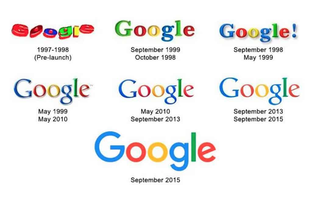
Styles change and trends come and go, as long your logo does not go with it. Having a logo that ages gracefully can create brand recognition and establish a level of quality. It also saves you money from having to go through the design process all over again.

Every component does not need to be checked off in order to create a great logo. As long as you and your designer address these components together, you can be sure to end up with a beautiful logo that achieves your business goals.

—–

Interested in creating a logo with our ViziSites designers that can stand the test of time? Take a look at our logo portfolio or contact a consultant today for a free demo!

Written by Michael Dea, Designer at ViziSites
Connect with Michael on LinkedIn

Best of Breed Partners


ViziSites has partnered with a collection of service providers in the veterinary industry and beyond. When you sign up on the Competitor package or higher, you’ll gain access to discounts with our partner businesses like VerticalVet Reminders, Veteos, Vetstoria Live Booking, and Anipanion Telemedicine!

Sign up to have your free e-book emailed to you today!