The extra swish at the end, the thickness of the curve, the decision to add a flourish – these are all visual components of the written word. Typography dives into these elements and many more when designers create a new font. But wait, what’s the difference between typography and a font? Simply put, typography is the style and arrangement of words to influence readability and design. Fonts are specifically the set of letters within a designed series.
With thousands of fonts in existence (915 on Google Fonts alone), sifting through so many options seems like a daunting task. What are the differences between a serif and sans serif font? What about using a word based logo instead of an icon? How do you use typography in your brand? Does the font have to match your color palette? We are going to get our heads out of the word cloud and hone in on using typography to your advantage.
Serif Vs. Sans Serif
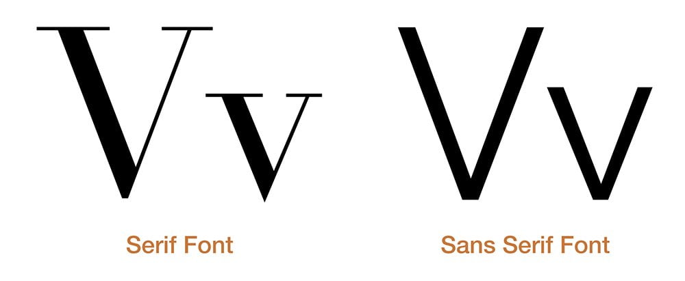
While there are several categories of font styles available, there are thankfully only two to really pay attention to. Serif fonts have a decorative element at the end of the letters, such as a straight bar or a swirl. Sans serif fonts remove this extra piece entirely so the focus goes towards the main body of the letter.
Serif fonts are known to be traditional, and sometimes dated, as they are more regularly used with official business documents. Current design trends have allowed sans serif fonts to take prominence in everyday life from menus to websites to logos. Now, there is nothing wrong with a serif font as newer fonts have been designed to take on some of the modern elements of the sans serif or to add extra character to avoid that document feel. Balance can also be achieved by using a serif font for headings and sans serif for the paragraph or body text. If the serif style matches your brand, go ahead and use it!

Designing a Monogram or Wordmark
Now that you have a font selected, you are ready to attach it to the icon your designer has created for you, right? What if you rewinded a bit and instead used your business name as your logo? This is where monograms and word marks jump into the game. Monograms, common in the fashion industry, take a few letters, such as the initials of your business name, in a creative way to make a logo. Wordmarks, on the other hand, use the entire word and stylise it in a unique way; just picture the logos of Disney, FedEx, and Google and you have a wordmark!
If there is a lack of imagery or maybe you are tired of seeing the same icons rehashed in your industry a thousand times over, consider using a monogram or wordmark as your logo.
Using Typography in Your Brand
Whether you choose a sans serif font or a wordmark as your logo, typography is an essential element of your brand. Because your name is going to be the clearest identifier of your brand, the font you choose should match the personality you want to represent. At the same time, the font should be legible, flexible so it is readable no matter the size or background it is on, and consistent with the design style you are using.

Finding the balance between a good logo, a unique color palette, and typography can seem difficult to achieve. Maintaining clear communication with your designer is the best way to set yourself on the path to success. Once every checkbox is marked off, your logo will surely stand the test of time.
—–
Want to take your typography beyond Times New Roman and Arial? Explore the ways typography brought our logos together or contact a consultant today for a free demo!
Written by Michael Dea, Designer at ViziSites
Connect with Michael on LinkedIn